Friday 9 December 2011
There's something wrong with my blog
Influence
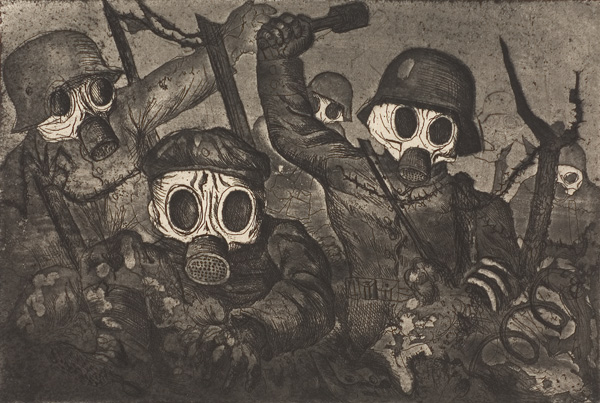
Influences wean it came to my drawing style came mainly from artist like Otto Dix with his sketches of nightmares he had from war. This picture is called Storm Troopers Advancing Under Gas. I am found of this picture as I like how Otto was able to turn these solders into faceless monsters with the barbaric poses he put his figures in and how he used only grays, blacks and whites helps create the illusion of the gas and the fears which created for people.
A other Influence is Francis Bacon which I am found of his work because work to be some of the most painful pieces of work I have ever seen. One series he did which stands out to me is the Base of the Crucifiction. I find this picture so effective because of a number of factors. One the figures are naturally deformed however still have human quality like the figure on left looks like it was a women as seen from her long curved neck, hour glass figure, long hair and she is wearing a dress however to be left there on the table like a mental piece with out arms or legs can suggest that she is depressed as she looks sad since her head is looking down. The figure in the middle has a interesting posture to it and makes it look like it is searing directly at however it has no eyes. The figure on the right is my favorite as I find it stands out more because of the striking pose of the its body and how its form looks like it is being stretched which explains why it screaming. However this pitcher could be a symbolic for how Jesus Christ had died on the cross. This could be because the all three could represent the stages which Jesus suffered though, the right being him dragging the cross as it looks like it is pulling something, the middle being placed on the cross as the middle figure looks tired from it's open mouth and bent figure and finally the nailing to the cross which is the third with the spikes on the floor. A other factor which makes this picture shocking is the back ground by how Bacon had used a harsh orange which makes the picture uneasy to look at which promotes that whole them of pain behind the picture. A other factor is how he applied the paint and how he used uneven brush strokes to make his picture seem like a ruff texture. I am also fond of this painting because I saw it in real life wean I went to the Tate Britten last year wean I wasstudying fine art in Six Form.

A other artist which I found useful for reface was my lecture Jonny Duddle how taught us how to use gray scale panting in photoshop which is the method of using a gray template on a picture then to work shades to define shape and form in your picture by showing were the light hits it and were the the picture is darker. Then you would change the colour with the color replacement tool to change the grays into color, which saves so much time compared to traditional methods. The result is a colorful display which highly resembles a traditional panting.
I am highly found of a few anime's which use very interesting art style like ''Hellsing OVA'' which tries to capture the style of the manga as seen in in this video on youtube and this capture from the manga. http://www.youtube.com/watch?v=6S6TomyMP9s
http://www.mangareader.net/205-13790-7/hellsing/chapter-65.htmlI really like this style as I find very dynamic in movement, perspectives and facial emotions but both use very thick lines which give a bold look to it, while some the poses may seem flat, it is the just from the style of the manga which allot of it looks like it may have been influenced by Otto Dix's work as Kouta Hirano the illustrator for Hellsing used allot of dead bodies piled up with a bold style similar to Otto's work. I am very fond of the tank fight scene in ghost in the shell (1996) wean kusanagi jumps on top of the tank and try's to destroy it wean her muscle swelled up and take a superhuman form but how the muscles formed and moved is some of the best animations of the human anatomy I have ever seen which is quite ironic as Anime is criticized mainly for having
single frame animations to cut on costs. When I saw this for the first time I was blown away as it made me say '' Oh My God!''. One thing which I noticed from looking at this was that animation team had deftly looked and have a understanding into a great amount of detail of life drawing. http://www.youtube.com/watch?v=uK8V9jG7Wjg
One of my most favorite themes in art style is from a anime called ''Baccano!'' which is set in 1930's America and captures the feel of the era. The reason why I am interested in it's art style is because you can see a striking resemblance to the work Edward Hopper how had painted one of my most favorite pictures which is ''Nighthawks''. The background used in ''Baccano!'' uses hoppers works influence as they use slimier textures and lighting of buildings to give it that painted look but the style in ''Baccano!'' does not have the element of loneliness as Edward Hoppers painted have and in a interview with Takahiro Omori the main animation director of ''Baccano!'' said that he doe's not know Edward Hopper. “I am not very familiar with Edward
Hopper. Maybe Akira Ito may know, but I don't think that we got our inspiration from there. Before we settled with the current art direction, Akira Ito put forward a few illustrations by some artists, but none of them clicked. We settled on what we have now after some trial and error. I suppose if I had to mention something we used some American comics, especially Mike Mignola's work such as Hellboy and Batman: The Animated Series, for reference.” http://www.youtube.com/watch?v=Msg8ypnLqaw

Inspiration
how he used only grays, blacks and whites helps create the illusion of the gas
and the fears which created for people.
“I am not very familiar with Edward Hopper. Maybe Akira Ito may know, but I don't think that we got our inspiration from there. Before we settled with the current art direction, Akira Ito put forward a few illustrations by some artists, but none of them clicked. We settled on what we have now after some trial and error. I suppose if I had to mention something we used some American comics, especially Mike Mignola's work such as Hellboy and Batman: The Animated Series, for reference.”
http://www.youtube.com/watch?v=Msg8ypnLqaw
Monday 28 November 2011
The Mascot


Thursday 24 November 2011
Introduction draft
Wednesday 16 November 2011
my blog task of the week


